Classic Shell
http://classicshell.net/forum/

Slight UI improvements on Windows 10
http://classicshell.net/forum/viewtopic.php?f=13&t=4818
Page 1 of 1

Author:  Arcane [ Wed Jul 29, 2015 10:41 am ]
Post subject:  Slight UI improvements on Windows 10

Hi, so I have upgraded from 8.1 + classic shell to W10 and I can see that I will not use the W10 start menu. I just got too much used to classic shell one. However there are some minor UI tweaks that I would like to set up as well if possible.


The first thing is the size of the taskbar and it's icons. I dunno if it just my feeling but it seems smaller than on 8.1. The icons are definitely smaller and it makes it harder for me to click them.

The second thing is that I can't change the color of the taskbar to my liking. On 8.1 I had it straight transparent with a little tint of black. Here I can choose only a color and if it uses aero glass or not. With that comes in hand the ability to see how many windows of certain app I have opened. That "new page" thich appears when I have for example two windows of explorer opened are almost invisible and it made working with windows on 8.1 easier.

And last thing is if there is a possibility to change the header color of the window. Right now it is only white which makes it harder to orientate in. I think it would look better if it had some color theme as the taskbar.

Those are my ideas :) Dunno if they are possible or not.

Author:  Gaurav [ Wed Jul 29, 2015 11:39 am ]
Post subject:  Re: Slight UI improvements on Windows 10

Yes the icons are smaller and I can't tolerate it either. But the Taskbar is part of Windows and icon size on it cannot be modified. It's just one of the many, many bad changes in Windows 10 which makes Windows 7 superior. Maybe if you increase the DPI they will get bigger but then the entire UI will be scaled up.

For taskbar color, look on the "Windows 10 Settings" tab in Classic Start Menu settings. It also has a taskbar opacity setting.

The title bar being white is another excruciatingly bad change in Windows 10 about which Classic Shell can't do anything either. But you could try this tweak: http://winaero.com/blog/get-colored-tit ... indows-10/ That hack though doesn't make it possible to differentiate between an active and inactive window.

Author:  Arcane [ Wed Jul 29, 2015 12:31 pm ]
Post subject:  Re: Slight UI improvements on Windows 10

Thank you for your tip on the title color. I used the manual method and it works, but the font obviously wasn't ready for this change and it behaves wierdly and is unreadable when not in focus. Also even though they are colored now, there is still no indication what window is in focus. I guess there is no way to mess with the font color right?


Author:  Gaurav [ Wed Jul 29, 2015 12:38 pm ]
Post subject:  Re: Slight UI improvements on Windows 10

Right that's about as good as it gets. It's better than all white though. In comparison to Windows 8 where it was so easy to distinguish active windows from inactive ones. Or even on Windows 7 with the bright red close button. Hopefully someone will release an unofficial theme for Windows 10 in the future to correct the title bar issue.

Author:  Splitwirez [ Wed Aug 05, 2015 6:05 pm ]
Post subject:  Re: Slight UI improvements on Windows 10

GauravK wrote:
Right that's about as good as it gets. It's better than all white though. In comparison to Windows 8 where it was so easy to distinguish active windows from inactive ones. Or even on Windows 7 with the bright red close button. Hopefully someone will release an unofficial theme for Windows 10 in the future to correct the title bar issue.


TrueTransparency can fix this issue RIGHT NOW!!! Get it here: http://mangosango.deviantart.com/journal/How-to-sort-of-get-Truetransparency-on-Win7-224038117 (I know it says Windows 7, but I've tested the download in there, and it works on Windows 10, albeit not flawlessly. There are a few derps here and there, and TrueTransparency x64 occasionally locks up, but if the white Window borders are that much of a problem, I'd imagine the bugs would be worth it)

Author:  Gaurav [ Wed Aug 05, 2015 9:55 pm ]
Post subject:  Re: Slight UI improvements on Windows 10

There is another option of using the Aero Lite theme: http://winaero.com/blog/different-activ ... indows-10/ That makes title bars usable however it makes the taskbar text black which is hard to see on a dark taskbar.

Author:  Splitwirez [ Thu Aug 06, 2015 3:57 am ]
Post subject:  Re: Slight UI improvements on Windows 10

GauravK wrote:
There is another option of using the Aero Lite theme: http://winaero.com/blog/different-activ ... indows-10/ That makes title bars usable however it makes the taskbar text black which is hard to see on a dark taskbar.


Um...doesn't Win10 Aerolite use the same colour for active and inactive Window borders? D:

Also, fun fact: The Aerolite theme has coloured titlebars for the same reason as the exploit which was mentioned earlier in this thread .___________.

Author:  Gaurav [ Thu Aug 06, 2015 5:07 am ]
Post subject:  Re: Slight UI improvements on Windows 10

Splitwirez wrote:
Um...doesn't Win10 Aerolite use the same colour for active and inactive Window borders? D:


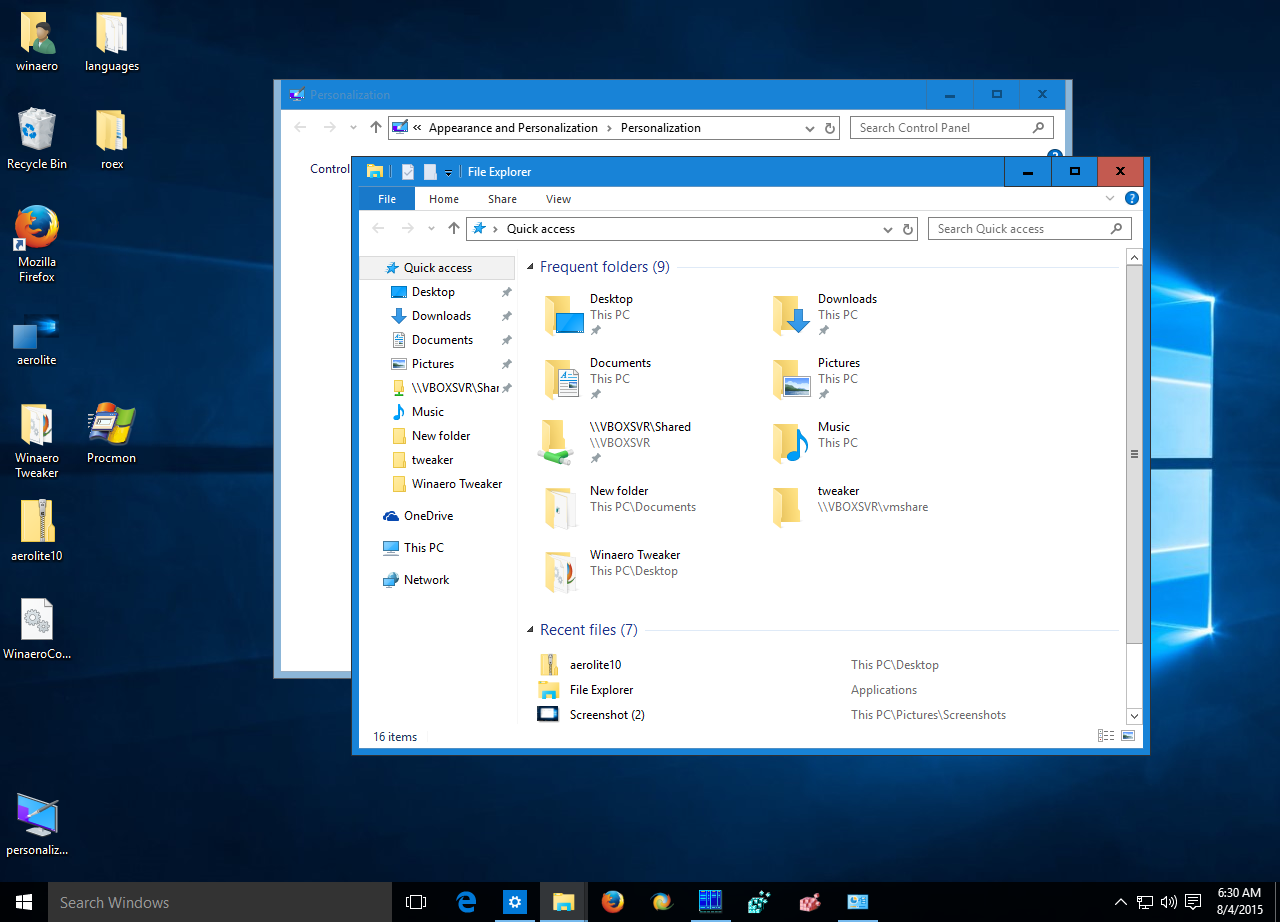
Yes the title bar color is the same but the red Close button is different and title bar text too:


Author:  Splitwirez [ Thu Aug 06, 2015 7:27 am ]
Post subject:  Re: Slight UI improvements on Windows 10

GauravK wrote:
Splitwirez wrote:
Um...doesn't Win10 Aerolite use the same colour for active and inactive Window borders? D:


Yes the title bar color is the same but the red Close button is different and title bar text too:


I said Window Border colour, not Title Bar/Caption colour...


...me, problem is solved, and that's good enough :mrgreen:

Author:  Gaurav [ Thu Aug 06, 2015 8:31 am ]
Post subject:  Re: Slight UI improvements on Windows 10

Ah yes window borders, they are different thank goodness! I just don't understand Microsoft. They add features like Snap to use windows side-by-side and then they make it hard for the user to figure out the active window? I mean c'mon this is getting rid of basic usability that even Windows 3.0 had! I've accidentally typed or sent Alt+F4 so many times to the wrong window on Windows 10.

Author:  Splitwirez [ Thu Aug 06, 2015 12:05 pm ]
Post subject:  Re: Slight UI improvements on Windows 10

GauravK wrote:
Ah yes window borders, they are different thank goodness! I just don't understand Microsoft. They add features like Snap to use windows side-by-side and then they make it hard for the user to figure out the active window? I mean c'mon this is getting rid of basic usability that even Windows 3.0 had! I've accidentally typed or sent Alt+F4 so many times to the wrong window on Windows 10.


Maybe I should just make a fixed Win10 Aero skin for TrueTransparency. Perhaps the inactive borders should be grey?

(Also, would I be allowed to share such a TrueTansparency skin here? It isn't Classic Shell, but it is relevant to this thread, so...)

(Also, if I did make that skin, would it benefit anyone more than Aerolite has?)

EDIT: Here's a quick first draft of the TrueTransparency skin:

Look promising? Worth the effort of finishing? And (more importantly), will this be of any use?

Page 1 of 1 All times are UTC - 8 hours [ DST ]
Powered by phpBB® Forum Software © phpBB Group
https://www.phpbb.com/